The oldest major cloud provider is AWS. During its early days, costs were fixed; other competitors, like Microsoft Azure and Google Cloud Platform (GCP), endeavored to compete with AWS by offering cheaper and more flexible services. Because of the reduced overall costs for cloud services, more companies migrated to the cloud. However, the pay-as-you-go model makes companies susceptible to leaving their services running in an unoptimized fashion, so cloud providers started rolling out native tools to prevent unnecessary spending.
Companies normally need more staff to provide the services mentioned above, so having a tool that automates the work of additional staff saves companies money. Hence the purpose of GCP’s built-in tools, like cloud billing reports, cost table reports, and more. GCP’s cost optimization tools are an excellent way to make the right decisions about cost management.
While GCP may offer wonderful cost optimization tools, as do other hyperscalers, they DO NOT provide tools to optimize cost across them. 90% of orgs today are multi-cloud. When native tools are not enough, consider CloudBolt.
Executive summary
In this article, we discuss the following built-in cost optimization tools, summarized below for your reference:
| Built-In Cost Optimization Tool | Description | |
|---|---|---|
| 1 | Cloud billing reports | Show current cost trends and forecasted costs based on past data |
| 2 | Cost table reports | Outline invoices per project per month |
| 3 | Cost breakdown reports | Show the gross on-demand cost and credits in a time range |
| 4 | Pricing report | List prices for each SKU for Google Cloud Platform and Google Maps Platform |
| 5 | Resource-based committed-use discount (CUD) analysis reports | Visualize commitment utilization and coverage for resource-based discounts |
| 6 | Spend-based CUD analysis reports | Visualize cost savings, utilization, and coverage for spend-based discounts |
| 7 | Exportable billing data | Data about usage, cost estimates, and pricing that can be exported to a BigQuery dataset |
1. Cloud billing reports
Cloud billing reports present a summary of the charges for a specific billing period, which is usually from the first day of a month until the last day. These reports show the spending in the current partial month as well as the forecasted spending based on collected data. They can be filtered based on the project, Google cloud service, region, and label.
The figure below is a sample cloud billing report. The report has three main elements: the billing period, cost trend chart, and cost trend table.
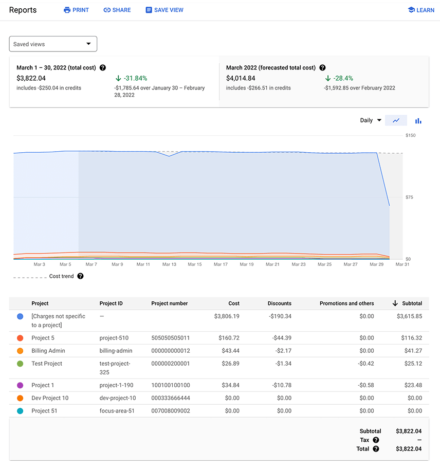
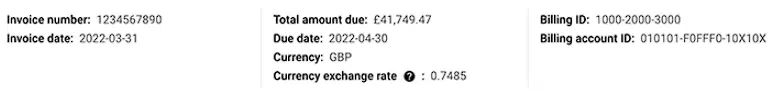
Here’s an example of a billing period:
The left half shows the total cost for the current billing period. It also details how much of it is composed of credits and includes the difference between the current and previous billing periods.
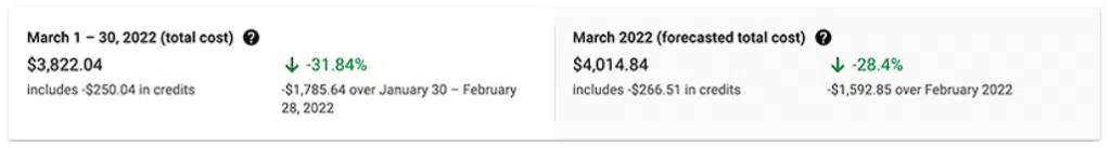
The following figure shows a cost trend chart.
The data can be grouped by project, project hierarchy, service, SKU, or region. The lines in the cost trend chart will change accordingly, allowing you to compare costs based on how you grouped the data. You can tweak the report’s settings using the filter sidebar and change the view from daily to daily cumulative, monthly, or monthly cumulative using the drop-down in the upper right corner.
The cost trend table is as follows:
This is basically the data contained within the cost trend chart but in tabular format. Like the cost trend chart, it will change based on the active filters.
2. Cost table reports
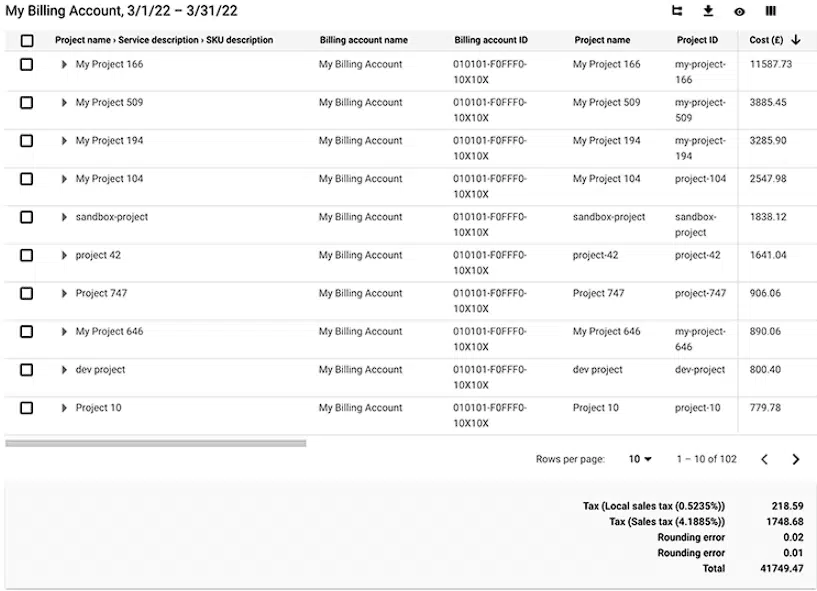
Cost table reports show the invoice by invoice month in tabular format. They are presented on the project level and include other details like tax costs, service IDs, SKU IDs, and project numbers. They are exportable to CSV. The figure below shows a sample cost table report.
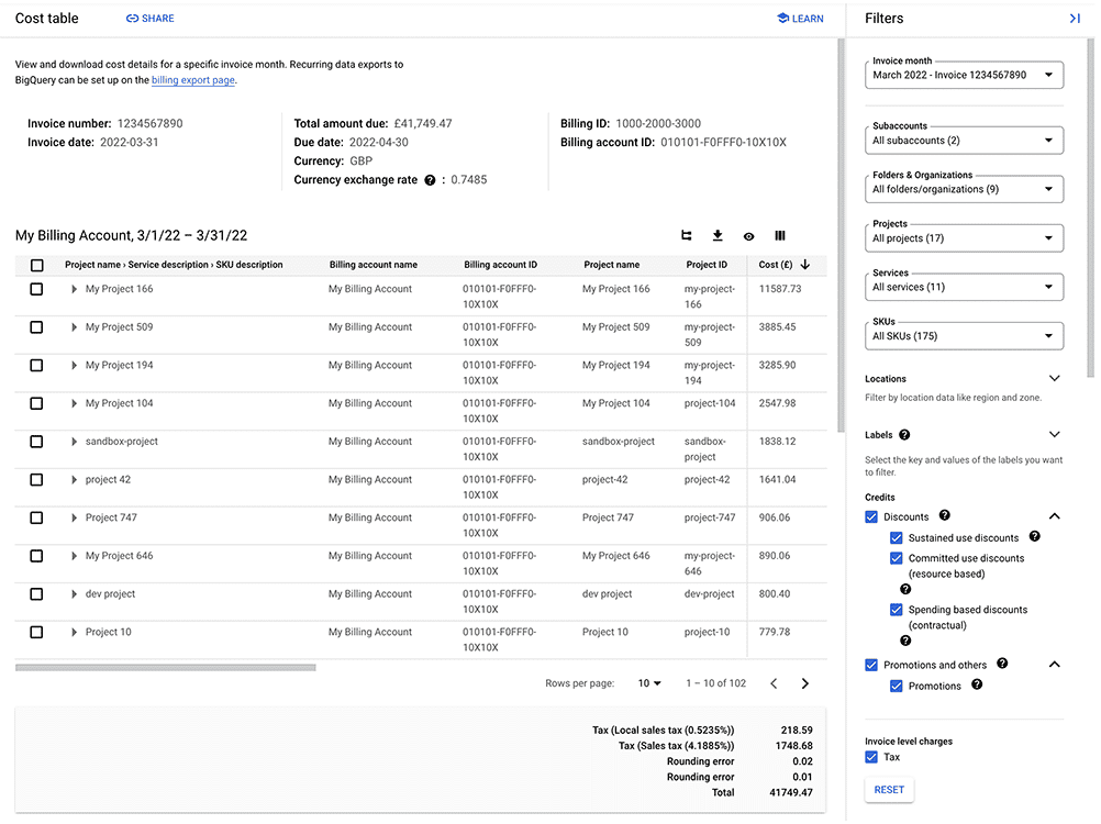
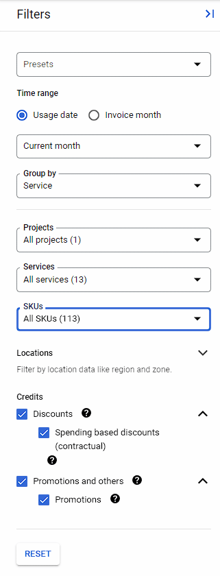
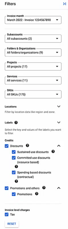
Like the cloud billing reports, these also include a filter sidebar that allows users to drill down into specific details like projects, services, SKUs, and labels.
The header portion of the cost table is a summary of the most essential invoice details, such as number, date, due date, and currency exchange rate. This information is relevant for auditing purposes.
The most detailed portion is the table of costs. Similar to the cost trend chart and cost trend table of the cloud billing reports, these will change according to the active filters. The table can be in a nested or flat view. The user can toggle between these two modes using the leftmost button in the group of buttons on the upper right of the table. The main difference between the views is that the nested view groups the rows according to the active filters, so it is easy to see the cost breakdown of each group. The flat view lists all the costs and credits as-is.
See the best multi-cloud management solution on the market, and when you book & attend your CloudBolt demo we’ll send you a $75 Amazon Gift Card.
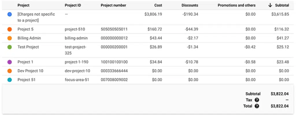
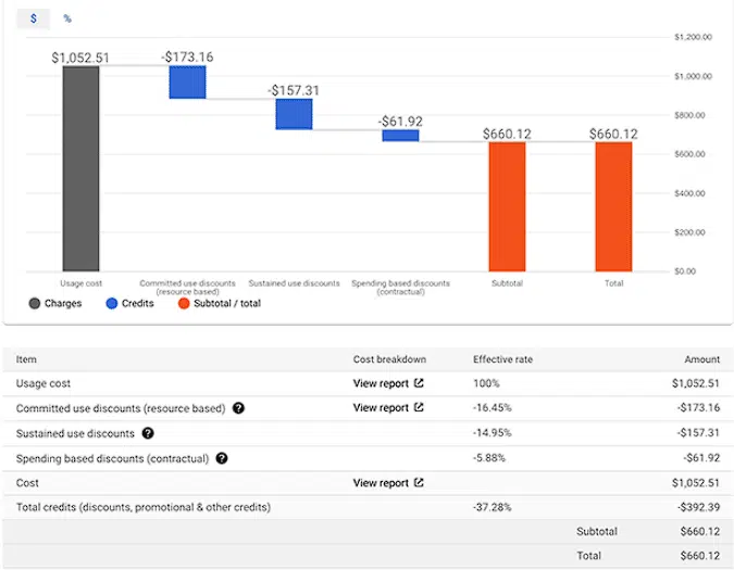
3. Cost breakdown report
The primary objective of this report is to show how the cost was computed in terms of credits, adjustments, and taxes. It is a bar chart that is extremely simple to understand.
A cloud billing account with standard list prices and a custom pricing contract have different cost breakdown reports. The figure below is a sample cost breakdown report for a billing account with standard list prices.
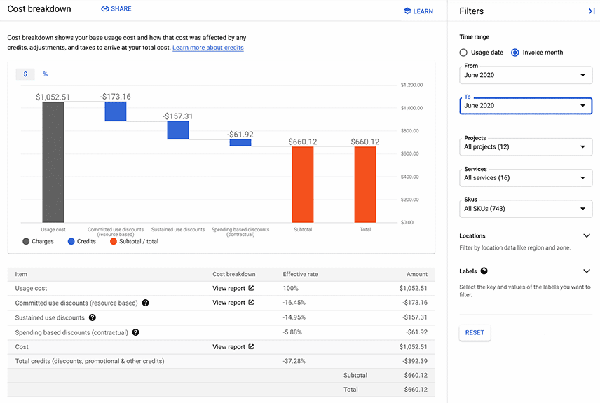
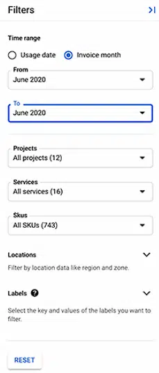
Like the previous reports, this one also has a filter sidebar that allows users to drill down into time, project, service, SKU, location, and label. The information to the left will change as the active filters change.
The chart consists of a gray bar that represents the on-demand cost. The blue bars represent any credits from resource-based, spend-based, and sustained-use discounts, while the orange bars represent the total after deducting the credits from the on-demand rate. The table below is simply a tabular summary of usage costs, discounts, and the corresponding total.
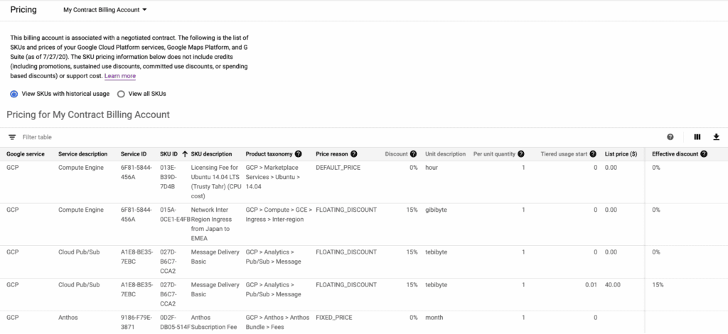
4. Pricing report
The pricing report is a list of updated SKU prices. The figure below is a sample pricing table, where each row corresponds to a certain SKU. The user can choose to view all SKUs that have been used.
Additionally, the pricing table is exportable to CSV.
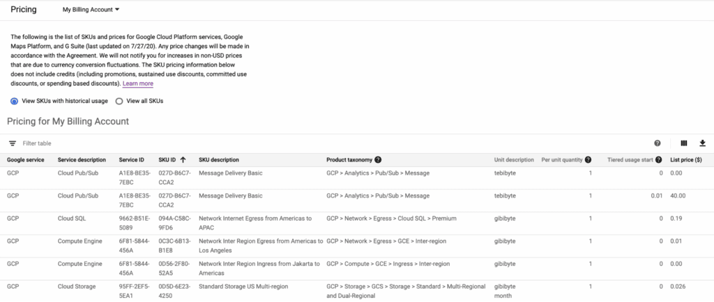
In the case of a cloud billing account with a custom pricing contract, an additional column called “effective discount” is included that represents the savings for the contract price compared to the list price.
Committed-use discount analysis reports
Each type of CUD has its own report dashboard.
5. Resource-based committed use discounts
These are available only for Compute Engine instances. Discounts are provided in exchange for a one-year or three-year contract stating that the user must use a certain minimum amount of resources. The types of resources include vCPU, RAM, and local SSD.
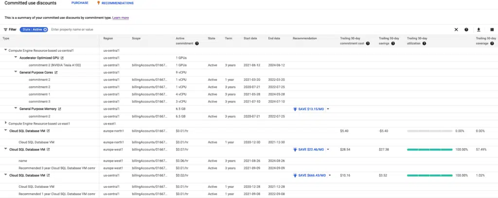
The figure below is a sample resource-based CUD analysis report.
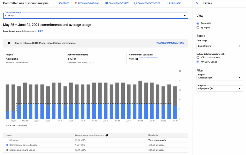
Discounts apply to each resource individually. Use the commitment type drop-down to choose the resource you want to analyze.
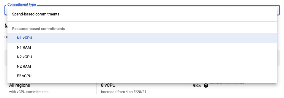
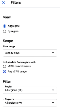
The filter sidebar allows users to drill down according to region, time range, and project.
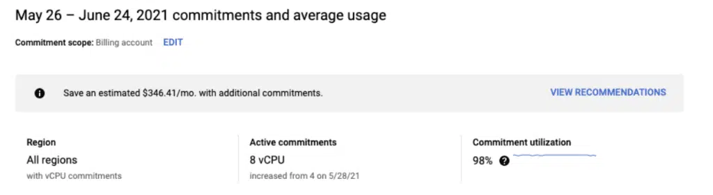
The three summary cards on top of the stacked bar chart detail which region has how many active commitments and the corresponding commitment utilization. They represent an excellent way to do a quick health check on whether or not the commitments are adequate and being used correctly.
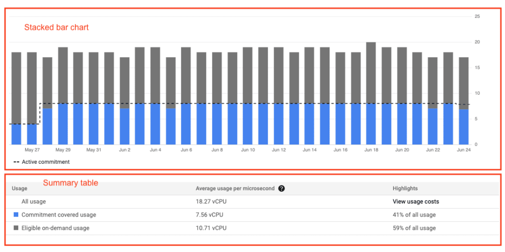
The stacked bar chart shows the on-demand usage versus commitment-covered usage per day. It answers the question: What percentage of on-demand usage is discounted by the commitment-covered usage?
The summary table below aggregates all the data and gives the total percentage breakdown between on-demand usage and commitment-covered usage.
|
Platform
|
Multi Cloud Integrations
|
Cost Management
|
Security & Compliance
|
Provisioning Automation
|
Automated Discovery
|
Infrastructure Testing
|
Collaborative Exchange
|
|---|---|---|---|---|---|---|---|
|
CloudHealth
|
✔
|
✔
|
✔
|
||||
|
Morpheus
|
✔
|
✔
|
✔
|
||||
|
CloudBolt
|
✔
|
✔
|
✔
|
✔
|
✔
|
✔
|
✔
|
6. Spend-based commitments
These commitments are available for Cloud SQL, Cloud Spanner, VMWare Engine, Cloud Run, and Compute Engine. Users can nab a deep discount by agreeing to a one-year or three-year contract with a minimum spending level.
The first few columns are type, region, scope, active commitment, state, term, start date, and end date.
The last several columns are the more interesting ones, containing the trailing 30-day savings, utilization, and coverage. These are all indicative of whether or not the discounts are being maximized. The recommendation column is also helpful for identifying areas of potential additional savings.
7. Exportable billing data
Cloud billing data can be exported to BigQuery and linked to a Looker or Google Data Studio report for the creation of a custom dashboard. However, to capture all relevant data, cloud billing data export should be enabled as soon as a cloud billing account is created.
Three types of data can be exported:
- Standard usage cost data: This contains standard information such as cost, usage, credits, adjustments, and currency.
- Detailed usage cost data: This contains resource-level data.
- Pricing data: This contains aggregated financial information.
Note that exporting data will also incur BigQuery costs.
Limitations
Lack of a unified dashboard
Google Cloud’s native tools offer a plethora of information, but it can be challenging to make sense of all the data at a holistic level. The unified dashboard provided by CloudBolt’s Accelerate Cost Optimization solves this problem by aggregating all the data and highlighting the action items immediately instead of having the user comb through too much data.
Cloud billing data for BigQuery datasets must be enabled before data is available
Cloud billing data for BigQuery datasets is not enabled by default and must be enabled before data is made available. This issue directly relates to the advice for exportable billing data. It is ideal to enable billing data when a cloud billing account is created to capture all data.
Customer-managed encryption keys (CMEK) are not supported when exporting billing data to BigQuery
To export billing data to BigQuery, the user must use Google-managed key encryption. This is a point of discussion for organizations with strict CMEK policies.
Best practices for GCP cost optimization tools
Promote the principles of FinOps in the organization
FinOps is a framework that defines how businesses should promote financial awareness and accountability. There are five key building blocks, one of them being cost optimization, within which the three key areas are resource optimization, pricing optimization, and architecture optimization.
Use a single billing account for each group of related projects
Organizations sometimes have a lot of projects, with each project falling within certain logical groups. Using a single billing account for each group is ideal so that all the appropriate costs are consolidated and aggregated automatically. It is recommended to have all projects under one organization and to use a resource manager to define the corresponding taxonomies.
Use labels and tags to track costs
A label can be applied to projects and resources to provide granularity when grouping resources logically. For instance, labels could be “dev,” “prod,” “staging,” etc. Users can then look for specific labels to determine how much each label consumes in terms of credits and charges. Tags provide a similar function; the key difference is that users can conditionally set policies with tags but not with labels.

Only solution with automated discovery, testing, provisioning, security, and cost management

A `single pane`for infrastructure spanning on-premise, private cloud, and multiple public clouds

A comprehensive framework that extends your existing tool investments and fills the gaps
Summary of key concepts
Google Cloud offers many native tools for Cloud Cost Optimization at no cost. These are quite comprehensive and can provide details related to billing and resources. However, one drawback is that there is no unified platform for all these tools. To combat the steep costs of hiring additional staff to fill the gap, consider using CloudBolt’s Accelerate Cost Optimization. It is a third-party tool that offers a unified platform where users can automate key cloud cost optimization tasks and a great way to optimize costs in the long run.
Related Blogs
How I Rethought Cloud Budgeting—And What Finance Leaders Need to Know
If you’re a finance leader trying to bring more structure and strategy to cloud budgeting, you’re not alone. While most…